Chatterbox helps refugees find meaningful employment as language trainers whilst providing customers with one-to-one lessons delivered by native speakers, with specific dialects and local experience in the regions they are spoken.
Opportunity
To simplify the booking process and reduce reliance on customer support
Chatterbox approached us, seeking improvements to their current booking process. They were hoping to improve conversion and enable users to make multiple bookings easily. Another key aim was for them to reduce customer service calls related to the booking form.
Discovery
Research and analysis phase
We conducted user interviews with existing Chatterbox users and non-Chatterbox language learners and usability testing on the existing site.
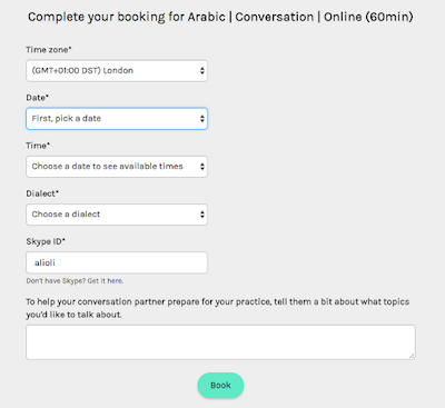
The usability testing showed some key functionality missing from the site; in particular, users could not edit or reschedule an existing booking, and the booking form itself was time-consuming to complete.
Competitive Analysis
We performed a competitive analysis of several different companies providing language training on-site in London or online. The most popular language offered at Chatterbox was Arabic, so we focused mainly on language services offering Arabic tuition.


We discovered that the competitors generally featured a detailed onboarding process, allowed students to book more than one class at a time, and, unlike Chatterbox's current system, could all be done on one platform.
Usabilty Testing
Key findings:
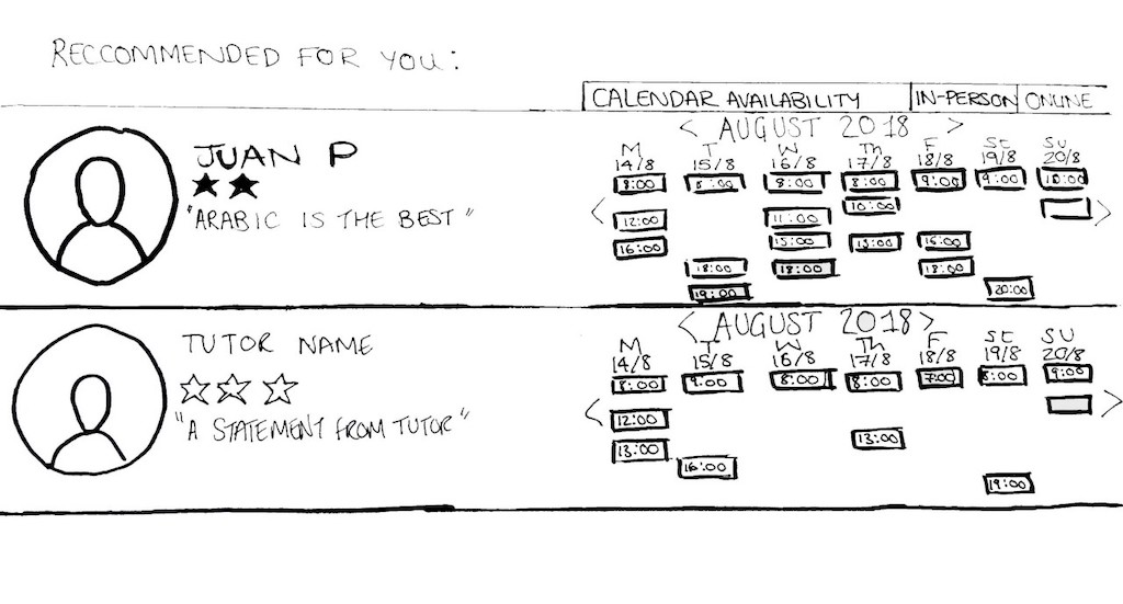
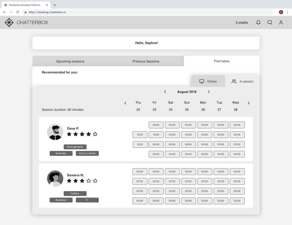
- Users were unable to visualise how their availability matched with tutors.
- Users had to input the same information repeatedly to book several sessions with the same tutor.
- Users were unsure whether they had completed the booking or whether they were waiting for confirmation from their tutor.
- Minimal information about the tutor was available, which we identified as necessary during user interviews.
User Interviews
We conducted user interviews with existing Chatterbox users and non-Chatterbox language learners.
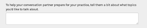
We found that it was important for students to select a tutor that they felt comfortable with, this often meant they looked online for more information on the tutor. One interviewee even said that he would search on Facebook for his prospective tutor. In the Chatterbox system, students were reaching out to tutors via a comment box placed on the booking form or by contacting the tutor directly via email.
Data
The company had previously researched customer satisfaction and usability. They provided Google Analytics Data, Hotjar screen recordings, and input from a comment box that allowed learners to reach out to tutors before sessions.
15
User Interviews10
Usability Tests7
Days4
Key insights
"It’s partially for me to learn the language but also to get to know someone and make a friend."
User Persona
Daphne is a Photojournalist providing impartial and honest imagery to various news media outlets. She travels to the Middle East regularly and wants to take her professional practice to the next level by improving her communication skills. She is an excellent photographer but feels limited by her inability to communicate in the native language.
Goals
- Feel relaxed and confident when speaking with Arabic native-speakers
- Strengthen her career with increased communication power
- Gain a deeper understanding of a culture that fascinates her
Frustrations
- Finds it difficult to communicate with colleagues and clients in their local dialect
- Traditional Arabic courses cover Modern Standard Arabic and aren’t adapted to her specific needs
Collaboration
Working closely with the client
Using the insights we had gathered from the different sources, we presented this to the client and suggested the points in the user's journey we could address to have the biggest impact. Through a design workshop we collaborated on which features might help to address the current paint points, then working with the team I developed these concepts and prioritised the work that we could achieve on a tight time scale.
Maps and flows
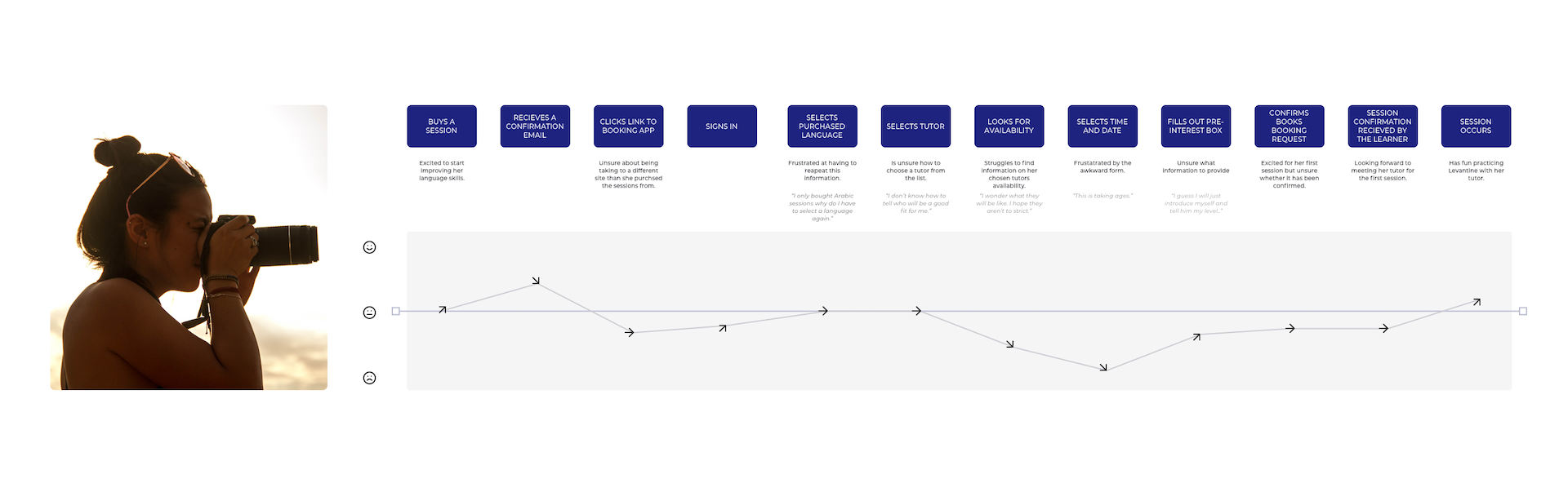
User experience map
Following this we drew out an experience map to help us identify the opportunities that we need to focus on to create the best journey for our persona Daphne and ultimately the users of Chatterbox as a whole.
Daphne is going to Syria on a work assignment and wants to practice conversational Levantine Arabic to help her communicate with co-workers. She buys a session from Chatterbox and wants to book a meeting with her tutor.
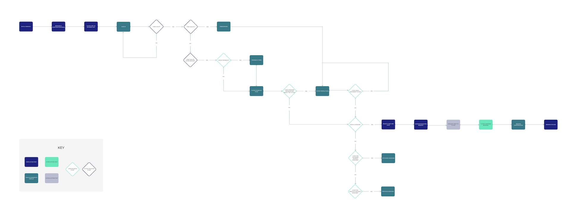
User flow
The user flow details the steps the user takes to navigate the system and the results they will see based on their choices. This diagram shows the journey for the initial booking and returning users leaving feedback and re-booking.
6
Iterations30
Usability Tests7
Days4
Key insightsInterface Design
Ideation, Concept and Iteration
Overview
We conducted six rounds of testing and iteration, from paper prototypes through digital wireframes of increasing fidelity. We realised that we could save the user time and cognitive loads by reducing the information they need to add each time they book a session. Providing a guided onboarding process to allow the user to give all the required information about their targets and goals would reduce the need to add this into each lesson booking, making it quicker and less stressful.
Key findings:
- Users were keen to see the tutor's skills and interests.
- Despite info given in onboarding, learners still wanted the opportunity to make a personal connection with the tutor before the lesson.
- Placing a learner needs analysis within the onboarding meant that the information could easily be shared with new tutors.
Workshops
We held an ideation workshop to come up with some different ways that we may be able to show these features on the interface. We used the time-boxed Crazy 8s method and then voted on the most robust ideas before moving on to refining them.
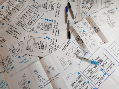
Paper-prototyping
Key findings:
- Users can move through the journey without significant issues.
- They needed clear information about whether the session had been confirmed.
- Participants wanted to be able to give feedback and make complaints without having to leave the platform./li>
Wireframing
With several rounds of testing and iterating at each stage, we slowly built the fidelity allowing us to gain more detailed insights and test the copy used in our designs.
Key findings:
- A tab system on the main page allowed users to keep all information about booking in one place.
- Users generally wanted to find out more information about tutors before choosing to book with them.
- People found it easy to make a booking for more than one lesson at a time.
- Users stated that they wouldn't need to revisit the profile page once they had met the tutor.
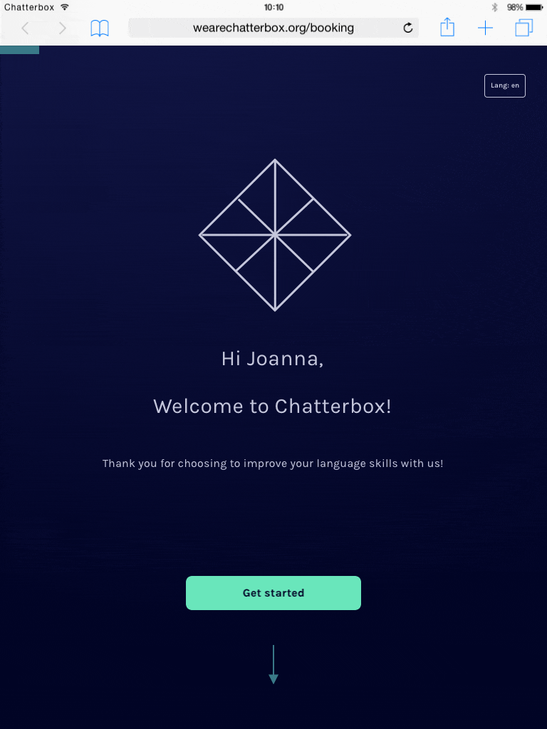
A redesigned onboarding experience that takes the needs analysis out of the first session
- Gives more time in sessions to focus on the subject matter.
- Helps tutors prepare for the session.
- Allows sessions to be tailored to the learner.
- Helps learners feel secure that they will have a session suitable for them.
- Removes the need to input this information at every booking.